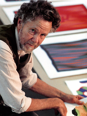
Lennart Rodhe (1916–2005) was one of the foremost modernist artists in Sweden. His major breakthrough happened in 1947, when he and a few artist colleagues
participated in the exhibition Ung konst (Young Art) at the gallery Färg och Form in Stockholm. His entire oeuvre is informed by a constant processing of colours, shapesand motifs. The year before he died, Margareta Rodhe founded the Lennart and Margareta Rodhe Foundation. This organisation was the universal heir of Lennart and Margareta Rodhe and now owns their entire art collection and the copyright to the
works.
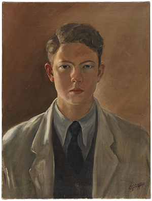 S, 1935
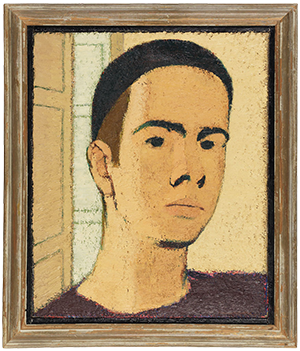 , 1937-38
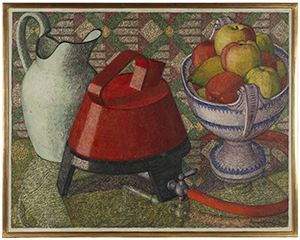
Gas Cooker with Fruits, 1939-41
Lennart Rodhe began his studies in Copenhagen in the 1930s. The Foundation’s collection includes a large number of early works from this period, mainly portraits, self-portraits, interiors and still lifes. Self-Portrait (1935), from the time before Copenhagen, shows a serious young man painted in meticulous and realistic detail. In 1938, Rodhe was accepted at the Royal Academy of Fine Arts in Stockholm. He continued to spend a great deal of time in Copenhagen, however, attending classes at the Kunstakademiet despite not formally being enrolled. Here, unlike in Stockholm, he had access to contemporary continental modernism. During this period, he painted Self-Portrait (1937-38) and Gas Cooker with Fruits (1939-41), revealing a new approach to painting and perceiving
the world. One of his still lifes features a simple gas burner, and the arrangement suggests a more dynamic, geometric composition. The German occupation
in 1939 forced him to leave Denmark, and he returned to Stockholm in 1940. Stockholm was isolated during the war, and international influences were limited and took a long time to reach the young artists. Rodhe resorted to a small, intimate sphere of subject matter and the Swedish countryside, painting numerous landscapes on the rocky coast of Bohuslän. (The Canal at Tjörnekalv, 1943.)
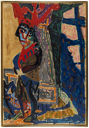
His continental childhood in Germany and his studies in Copenhagen may have contributed to Lennart Rodhe’s difficulties in adjusting to the Academy in Stockholm. He did not start painting at the Academy until his final years, when Sven X-et Erixson was his professor. An arrangement with an old woman as a model captured his interest in 1944, giving rise to a long series of studies and variations on the theme. Several of these studies (Study for Actress), (Study for Actress), and (Study for Actress), all made in 1944, are in the Foundation’s collection, along with Untitled, Study for Actress from 1944. These paintings show influences both from cubism and from the colours and wild brushwork of Matisse. Rodhe has not endeavoured to create harmony in his studies; instead, these images are characterised by strong, unsettling contrasts between light and darkness. Despite the involuntary isolation, the young artists were not unaware of developments in a war-torn Europe, and these existential and dark traits began to appear in Rodhe’s post-war works.
 , 1944
 , 1942
, 1941
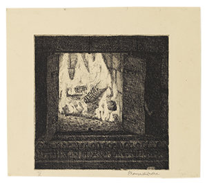
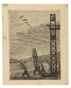
Graphic art was to have a considerable share in Rhode’s practice. His first prints were made during his time at the Academy, and the collection shows them at various development stages. A few of his first etchings from the early 1940s, Tile Stove with Fire, and The Katarinahissen Lift, were made after drawings (The Katarinahissen Lift, 1941, and Untitled, Tile Stove and Fire, 1942). For many young artists at the time, prints and public commissions were a means of making art more democratic and accessible. In the 1950s, he produced few but nonetheless important prints, but in the 1960s he worked on more extensive series on the subjects of Seston, Day and Night, The Family, and Sign Figures.
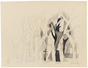
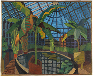
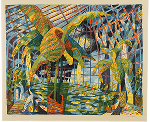
In the post-war period, art was seen as a positive social influence, and there were ambitions to spread good art to the general public in the form of prints. For the Nationalmuseum’s exhibition “Good art in homes and community halls” in 1945, Rodhe designed a series of sketches for a park-like Churchyard (1945). The scene is from Uppsala, and in these works Rodhe combines abstraction with figuration. Mingled with the scattered crosses are trees with shapes that suggest writhing human figures (Churchyard, sketches, 1944, Uppsala Churchyard, 1944). The print portfolio did not include the churchyard scene but a motif from the greenhouse in Uppsala Botanical Gardens. Beyond the greenhouse lattices, beyond the verdant, tropical greenery and the reflections in the pond, the tortured motif of the churchyard is still present in this work (The Greenhouse, 1945). The lithographic print with the same title from 1945 features several of the themes that Rodhe worked on in his mature oeuvre, abstract forms inspired by nature and plant life, grids and the potential of reflections to add new motifs and perspectives. Several studies, sketches and drawings relating to the Churchyard and Greenhouse themes are in the collection.
 , 1945
, ca 1945
, 1945
 , 1953
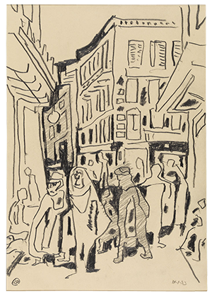
After the war, Europe was again open and free. In 1947, Rodhe made his first trips to France and Italy, resulting in a plethora of travel drawings. A few years later, he travelled again, visiting France, Italy, Spain and North Africa. (At the Louvre, 1947). His swift yet precise ink drawings reveal his curiosity about the cultures and everyday life he encountered there. The travel drawings continued to be a vital element in Rodhe’s practice, and there are many works of this kind in the collection, including Street Scene from North Africa, 1953. These trips also helped develop his artistic skills and provided new subjects for him to explore. The triangle theme appeared in Paris in the late 1940s, the Blocks and Rotors came to him in Capri in 1953, and the latter, despite their concrete style, are explorations of light and shade in city scenes. (Block Drawing, 1954). Moreover, Islamic art, especially the patterns and ornamentation, had a pivotal and lasting influence on him throughout his career.
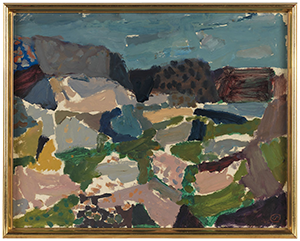
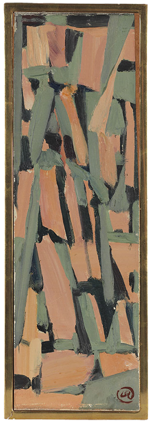
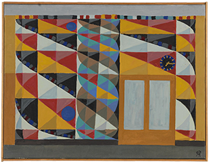
Rodhe spent several summers in the 1940s and early 1950s on the Swedish west coast. These sojourns generated a large number of landscape studies in the artless, immediate plein-air style, as in Cliffs by the Sea, 1946. The artist eventually began using geometric patterns under his scenes, which were painted on transparent architectural drawing paper. This is where he developed, and exhausted his triangular theme (Triangular Play, 1947), and these studies led to an increasingly abstract and concrete style. He explored themes such as Cracks in the Cliffs (Cracks, 1952), which in turn led to the theme The Surface Cleaves (The Surface Cleaves, 1952), several of which are in the Foundation’s collection. It was during this period that Rodhe received his first major public commission, which was to occupy him intensely for several years. Both the Stair theme in Ängbyskolan school (1953) and Package Belt for Östersund Post Office (1952) include formal elements that the artist found in Bohuslän; the light and shade on the cliffs engendered the triangular shapes, and the twisted sea shells gave the spiral.
 , 1946
, 1952
, 1952
 , 1956
, ca 1958
, 1999
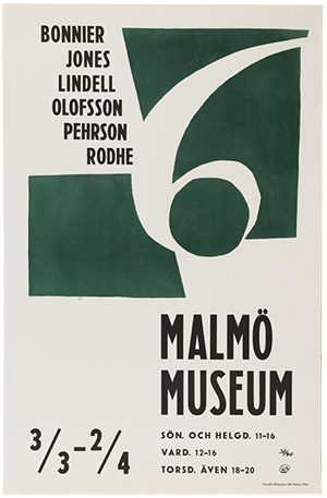
In the pivotal period from the 1940s to 1950s, Lennart Rodhe was associated with The Men of 1947, originally a group featured in the exhibition “Ung Konst” (Young Art) at Galleri Färg och Form. He also participated in other exhibitions focusing on concretism, including “6” in 1956 at Malmö Museum, for which he also designed a poster in edition, 6, Bonnier, Jones, Lindell, Olofsson, Pehrsson, Rodhe. The triangle theme led to themes based on Blocks – possibly the artist’s most concrete works. It is typical for Rodhe that he nevertheless used observations of nature as his starting point, with the play of light and shadow on buildings and flat roofs in Capri, for instance. His block drawings are purified, all the shapes fill a purpose in a play of positive and negative volumes. The blocks are arranged asymmetrically on the paper’s surface, no part of the drawing is central, all parts are of equal value. A few years later, Rodhe elaborated on this theme in what he called Fruits and Blocks. In 1955, he was commissioned to design three large glass windows for Svenska Handelsbanken’s Stockholm office. He began sketching in Saint-Tropez, and it was the deep contrasts between light and dark in the fig trees and grape vines that inspired Rodhe to combine the blocks with round shapes, as in Untitled, Fruits and Blocks (c. 1958). The orchard and the fruit theme recur in drawings, paintings and prints from the late 1950s, and in the portfolio with the Seasons triptych, published by Konstfrämjandet in 1960 (The Seasons, Autumn, 1960). The contrasts between colours and the play of light, and how shapes can form patterns, are seen throughout Rodhe’s artistic oeuvre. Much later, he revisited the study of light in the trees in suites of drawings from his summer house Flivik (Untitled, 1999), but it also appears in his late works with branches and reflections in the forest.
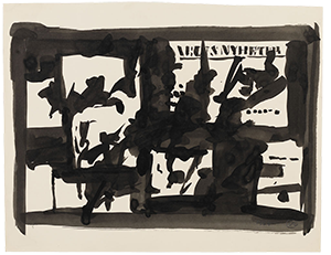
In the early 1960s, Rodhe was engaged in a monumental work for the Department of Ecology and Genetics at Uppsala University. He based it on the researchers’ material – aquatic life forms in the samples they studied – as in Plankton, water under a microscope, from 1962. Countless drawings and watercolours were made, organisms, particles and seston were examined under the microscope, but the artist also made freer compositional studies to capture the multitude of life forms. (Seston, 1962). The collection includes a large body of this material from 1961-1963, much of it titled Seston, which also became the title of the monumental work in Uppsala. Another prestigious commission was Day and Night for the newspaper Dagens Nyheter’s building in Stockholm. This project lasted from 1963 to 1967 and resulted in experiments exploring the newspaper theme and the fading world of newspaper culture ¬– the Klara district in Stockholm – but also composition itself. The newspaper motif as such invited a style based on collage, where fragments of image and text, and newspaper ink on white paper inspired elaborations with positive and negative shapes, and with light and darkness. Rodhe examined this potential in countless smaller paintings and drawings, such as the ink drawing Untitled study for Day and Night (1964), and the painting Newspaper Triptych (1964). Marabouparken in Stockholm has a work that is closely related to Day and Night, Signs of the City (1970), also in glazed stoneware.
 , 1962
, 1964
 , 1964
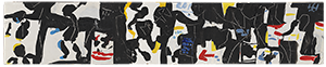
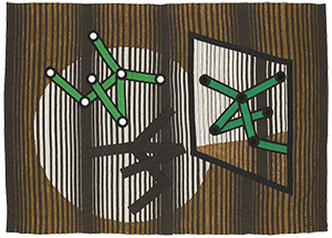
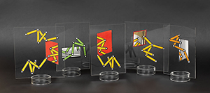
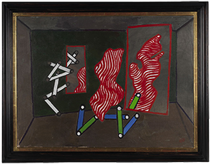
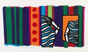
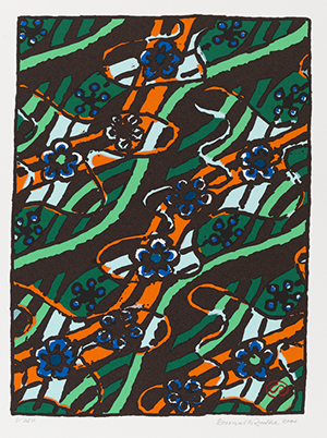
In the 1960s, Rodhe was commissioned for several textile works, and began collaborating with the Association of Friends of Textile Art (Handarbetets vänner). The collection includes numerous sketches and cartoons for these works, including Signs in the Archive (1970) for the National Archives, and Gold and Green Forests (1975-1976) for the Riksbank. The former assignment gave rise to a new theme, Sign Figures, which engendered a vast number of independent works in the form of drawings, objects, tapestries and paintings. They originated in the commission to design a monumental textile work for the National Archives research room, which he received in 1966 and worked on for many years. The Sign Figures were interpretations of mediaeval drawings in book margins that Rodhe had seen in the Archive collections. Despite their terse simplification, these signs look like human characters. They hover above the pictorial surface, illuminated as if by spotlights on a stage, and reflections inject other pictorial planes into the motif. Mirrorings are another theme that the artist has pursued, and while working on his Sign Figures he was at his most playful. Through his collaboration with the Friends, and by employing a simple technique of creating the signs and other pictorial elements with appliqué on the tapestry, he produced a series of smaller textile works, such as Mirror Image (1972). Signs also feature in a series of acrylic glass objects, where the figures are made in a collage technique, all with the title Reflecting Figure (1968), and in a long series of screen prints (The City, 1970), drawings (Studio Door with Curtain, 1972), and paintings (The Milliner, 1972). Gold and Green Forests revisits his 1950s experiments with light and shadows among the leaves, strong contrasts and shimmering colours – which Rodhe later used in another set of motifs, Shiva Pattern and Woodland Reflections.
 , 1972
, 1968
, 1972
 , 1971
, 1972
The 1960s heralded a new medium, in the form of textile art. The pliability of fabric inspired new imagery, where Rodhe played with pictorial depth using billowing lines and simple figures in perspective. But this also led to the productive encounter with the printer Ove Löf, who demonstrated the potential of screen printing. During this period, and into the 1970s, Rodhe produced rapid sketches in ordinary felt tip pens. Some of these works have survived in the Foundation’s collection. Rodhe was well aware that this material would fade, but it gave him the possibility to explore an immediate style, and the transparency of felt tips enabled a pictorial space similar to the one he used in the tapestry Signs in the archive (1970), where the folds create movement and volume. Screen printing was a method that was well-suited to this kind of work, and the drawings could be preserved; this, along with a major commission from Konstfrämjandet for prints, generated a veritable stream of new works. (Floral Fence, 1971). Many of these, such as the series of curtains, have textile motifs (Curtain, Blue, 1971). Curtains and draped figures come to life in the shallow pictorial space, as in Inspiration (1972) and The Visit (1972). Another recurring theme in these works is reflections, as in Curious (1972). In 1970-1972, Rodhe produced a large number of prints for Konstfrämjandet’s exhibition “46 Screen Prints”; several of them were based on felt tip drawings and on his playful Sign Figures.
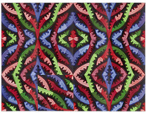
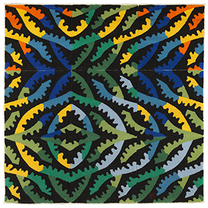
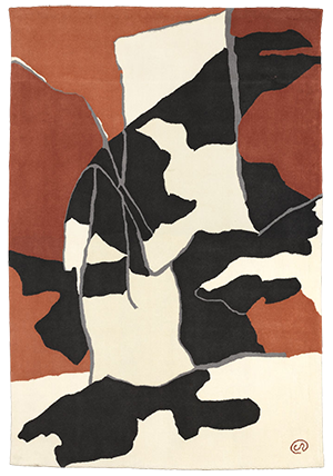
In the early 1970s, Lennart Rodhe was commissioned to design curtains for the Kulturhuset auditorium in Stockholm. As these works were to be block printed on velvet, partly to keep the costs down, the artist had the opportunity to explore and develop his long-standing interest in ornamentation, and especially Islamic patterns. Numerous print variations were created, but the main focus in the work Shiva is a version that suggests both oriental patterns and the play of light in Swedish forests. The works Shiva and Columns, which no longer exist, were installed in 1976. Rodhe continued to elaborate on Shiva for many years, creating many new works in various techniques, paintings such as Garden of Eden (ca 1991), drawings, prints (Tiveden Blue, 1987), and a few hand-tufted carpets. Rodhe found the pattern technique in Islamic art. But it was the dense coniferous forest that inspired what became one of his most familiar motifs in his late oeuvre, with titles such as Forest (1979) and The Forest Reflects Itself (1977). The collection includes many works on this theme, along with a few smaller ones on the theme of Tiveden (Tiveden I, Tiveden II, Tiveden III). The same basic pattern can be varied endlessly in both colours and how the pieces are combined. Together with Kasthall, Rodhe designed a few carpets with these patterns, including Garden of Eden (1991) and Yellow Lightening Forest (1989), of which a few are in the Foundation’s collection.
 , ca 1991
, 1989
 , 1986
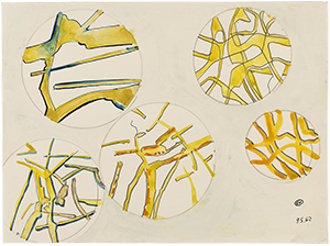
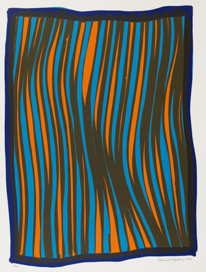
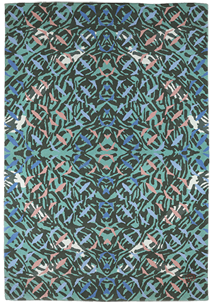
From the late 1970s and onwards, Lennart Rodhe dedicated himself to patterns and reflections. The reflections had appeared in his works already in the 1940s, as in his lithograph The Green House from 1947, in his Sign Figures, and later in the Shiva prints. Reflections create new rooms in the image, and they play with the pictorial surface and depth. Reflections also feature in his geometrical patterns – by twisting and reversing a repeat print, he created larger and more complex interweaving shapes (Mogador, 1980). In a series of prints, Rodhe explores reflections on the water on the theme of Currents. Through the shimmering and glittering surface, we glimpse a fragmentary image of the river bed. (Spring Water Fragmented Right, 1983). These prints were used as cartoons for several large, hand-knotted carpets made for Kasthall, including Eau de Source (1983) and The Green Current I (1986), of which several are in the Foundation’s collection.
In 1986, a new theme appeared in Rodhe’s practice. A number of drawings from a sketchbook small enough to hold in the palm of his hand were developed as screen prints and simple copies, prints, paintings and textile works. This long series was named Bagatelles – for its unassuming and open character. The bagatelles are like diary entries, contemplations in pictures rather than words; they can be twisted and turned and transform from one moment to the next into new motifs or grow from small to monumental. He elaborated on these drawings in prints and paintings, giving them titles that allude to something the artist saw in the picture, as in the prints Sisyphus (1987), Sheaf (1987), and Wailing Animals (1989). The last two were also used as cartoons for carpets for Kasthall in 1987 and 1989.
 , 1992
 , ca 1999
, 1999
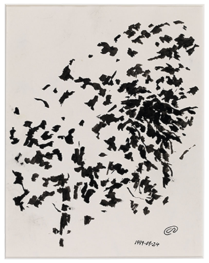
In the late 1990s, Rodhe began working on Water Lilies on the River, a new theme that was developed, like Shiva and Tiveden, into repeat prints the size of a wall. A photocopier was used to enlarge and reverse the elements. The theme is characterised by the photocopier’s enlarged, thick black lines, which the artist incorporated in his folklore-inspired patterns, as seen in Water Lilies on the River (ca 1999). This pattern was used mainly for prints, in smaller formats on Japanese paper, but also in large formats consisting of several parts that were joined up. In 1997, Rodhe was invited to participate in “Avesta Art”, for which he created a red version titled Avesta River. The following year, the motif featured on advertising pillars when Stockholm was Cultural Capital of Europe. The pattern is based on river currents, red-hot iron from the furnace, and water lilies and aquatic plants that curl decoratively across the surface, alluding to Avesta’s historic iron industry. Among the latest works in the collection are scenes from Flivik, the artist’s summer house in Småland, which he returned to often to capture the play of light in the summer greenery, in rapid, impressionist sketches, as in Flivik Drawing (2000).
Sofia Bertilsson, 2014
Thomas Millroth, Lennart Rodhe, Sveriges Allmänna Konstförening, Uddevalla 1989
Börje Magnusson och Thomas Millroth, Rodhe som grafiker, Atlantis, Värnamo 1993
Per Bjurström, Bagateller, Carlssons bokförlag, Malmö 1995
Per Bjurström, Blockteckningar och reseskisser, Carlssons bokförlag, Malmö 1995
Mailis Stensman, Rodhe som textilare, Norstedts förlag, Värnamo 1995
The book Rodhe som grafiker (Rodhe as a Graphic Artist) includes a comprehensive biography and bibliography, along with an index stating where his prints have been exhibited.